
A bikini purchase should be fun, but realistically, nothing is more stressful than sifting through racks or endless pages online. If you’re anything like the average person, you’ve realized that there are certain colours that look better on you than others. But dissecting the science behind it (and more importantly, which ones you should buy) is nearly impossible.
The good news? There’s a scientific reason for those bikini colours that look amazing and others that make you look washed out, ghost-like, or worse. It all comes down to your skin tone. Once you determine this small detail, your shopping experience will become much easier.
What is an Undertone?
Before venturing into what colours are best for you, it’s essential to establish the undertones that will flatter you most. An undertone is not your skin tone (light, medium, dark, etc.); it’s the colour that’s playing from underneath your skin.
There are three major undertones – cool, warm and neutral. Cool undertones feature a slight pink/red/blue hue from underneath the skin while warm undertones show a slight tint of yellow/peach/golden. Neutral undertones are just that – neutral – with both versions coming in slightly; if you’re a neutral undertone then almost any colour will work.
For example, check your veins. When you look at your wrist and assess your veins in natural lighting, if they’re blue/purple you’ve got cool undertones; if they’re green, you’ve got warm undertones. If they’re a shade of blue or green that is impossible to tell definitively, then you’re neutral.
Also think about which jewellery looks better on you – silver (cool) or gold (warm). Even consider what white versus cream looks better – white versus cream (crisp versus beige) can show you whether you’re better off with cool whites or warm creams.
If you’re neutral undertone, it’s often easy for colours to work because neither end of the spectrum is too harsh against one’s skin.
Best Colours For Cool Undertones
If you’ve got cool undertones, great! You’ll look good in jewel tones. Emerald greens and sapphire blues are good choices; purples will work with the pink/blue hues of the skin.
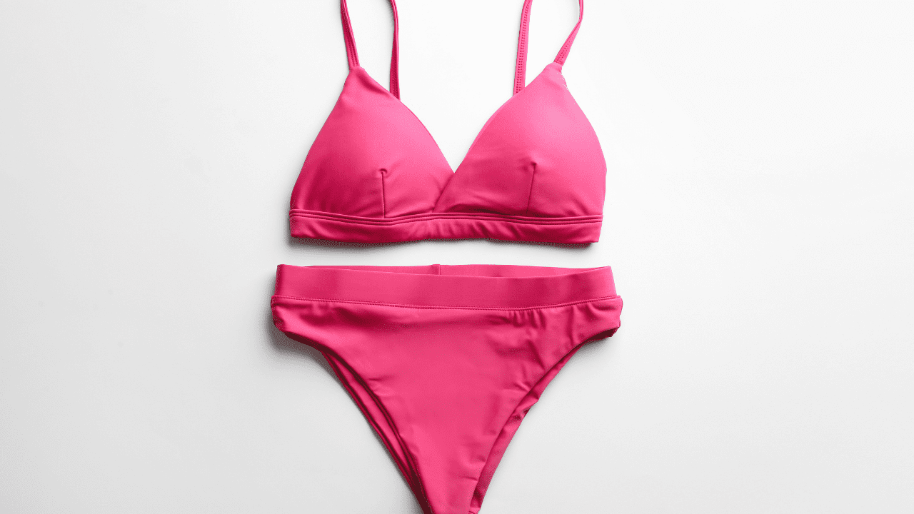
True colours work best as well – bright pink and bright red (cherry – not tomato) look stunning against cool colours. Cool blues work well too – navy (best) versus royal blue. Even some shades of pink (not too coral/peach) will help compliment a rosy complexion.
No go? Oranges and yellows will not compliment cool complexes; this does not mean you should never wear them again; this means that those colours don’t work as well with the cool undertones. If there’s a way to incorporate them (peach/orange pastels) go for it; but they’re a riskier option.
Best Colours For Warm Undertones
Good news! If you’ve got warm toned skin, you’re golden; earth tones work well with just about any colour in the world besides pastels and icy colours. Coral. Peach. Warm Red (not too tomato). Golds look great with warm tan skin. These colours pick up the colours in the skin and make them pop.
Some olive green/brown tones/warm browns/burnt orange play nicely on warm-toned individuals. Certain purples work but only the rusty/bricked versions – not the cool blues.
Ice blues and whites do not always work all that well; this does not mean you can never wear them again, it means that whites have to be chosen carefully as well as some lighter ice greens – and ice yellows may wash out a complex beautifully.
Best Colours For Pale Skin
If you’ve got pale skin sometimes it feels like there’s a limited selection – but this is not true at all. In fact, some versions lend themselves with beautiful contrast while others create an empty washed-out feel.
For example, if you’re pale with cool tones, pastels might be a good fit – lavender blues/pinks – but don’t sleep on dark hues either; vibrant jewel tones pop against pale skin.
For fair skin with warm undertones, you want to be a bit more strategic. Soft, warm colors like peach, coral, and warm pink work beautifully. Looking for something bolder? A colourful bikini + best colour bikini for pale skin might be turquoise, teal, rich emerald, or even deep red—these shades create beautiful contrast without washing you out.
The problem lies with light pale skin blending in easily with certain colours. Be careful of light yellow/pastel green – they wash out the lightest of skins very easily. Beware of neons too – they reflect interestingly against light skin at strange angles.
Medium Skin Tones/Olive Skin Tones
If you’ve got medium colour or olive toned skin, you’re golden; go vibrant! Vivid colours work phenomenally well on medium skin tones when they pop thanks to saturation against their complexions.
For example, think bright coral (in general), cobalt blue, emerald green or vibrant purple – they’re bright enough to make an impact but subdued enough not to overpower paler or darker skin tones.
Medium colour tones look great with earth tones – burnt sienna/olive green/terracotta/warm browns – all look phenomenal with their counterpart Olive-toned skins. Metallics play nicely too – with gold/bronze looking incredible.
For medium skin, very pale options – pale pastels – look dingy against mediums and don’t make them feel fresh. If you love pastel versions, select another option altogether that boasts saturated colours instead of the washed-out alternatives.
Dark Skin Tones
Pretty much any colour looks amazing on deep skinned individuals; vibrant hot pink/electric blue/bright orange/vivid yellow pop against darker skins – pure white/bright white looks great against darker skin.
In addition, jewel tones reign supreme once more; deep emerald/purple/sapphire blue/etc. all look fantastic against darker-coloured skins – even neon colours which make them look overwhelming on other skin tones – but not here!
On the contrary black/dark navy other darks do not work all that well – they blend too easily – but they do not need to be written off either; they work like sexy black pieces – they just don’t pop.
Patterns and Prints: That’s Different
It’s one thing to assess solid colours but what about prints? As a general rule of thumb consider the most dominant colour and apply the same rules regarding undertones versus regular shades due to intensity.
For example, if there’s a dominant colour against white background it’s going to function differently than a black background with that colour as the most prominent pattern. The elements closest to your skin matter most.
If there’s a multi-coloured pattern it gets easier since there are multiple shades that might/could work together or apart – unlikely that one colour would be a “deal breaker” when three others are doing nicely.
Trust Your Instincts
If all else fails, trust your instincts. This might seem like an easy rule of thumb but after all, rules are made to be broken. If you see a colour that “shouldn’t” work on your specific body according to conventional science, but you love it then get it.
Confidence makes every bikini gorgeous! Sometimes the one you’d expect would be fabulous ends up flopping – and vice versa; you’re wearing it – not anyone else – and it needs to empower YOU!
So, try it on (or if online shopping order with good return policy). Take pictures in natural light and see how you feel because when you’re looking in the mirror your vibe typically tells you everything.
See more fashion posts here

Becky is the voice behind Life in Velvet, an organised, intentional living blog focused on practical food, calm homes, thoughtful projects, and everyday systems that make real life feel easier. A mum of 3 living in the UK, Becky writes from lived experience, sharing what works, what doesn’t, and the decisions that make family life run more smoothly.
With a background in marketing and content writing, and over a decade of blogging experience, she brings a thoughtful, structured approach to everything from baking and home projects to routines and decision-making. Life in Velvet is where planning meets creativity, with ideas designed for real homes and real life.